
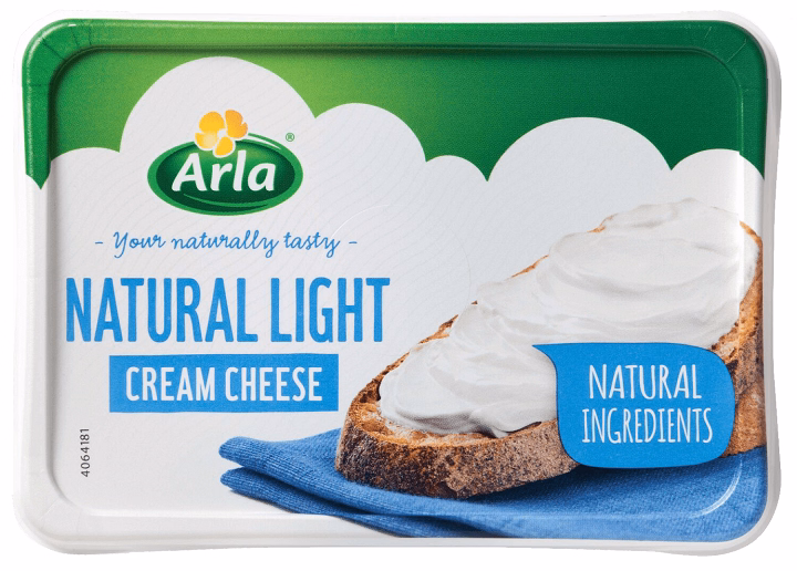
Light cream cheese is a popular, creamy spread that has a smooth texture and a slightly tangy flavor. Drawing light cream cheese provides an opportunity to practice capturing soft, smooth textures and subtle glossiness. Whether you’re illustrating a tub of cream cheese, a spread on a bagel, or just the texture itself, this guide will help you master the details and bring this delicious dairy product to life.
Table of Contents
Why Would You Want to Draw Light Cream Cheese?
Master Smooth and Soft Textures

Cream cheese’s smooth and creamy texture is ideal for practicing shading techniques and smooth gradients in your drawings.
Experiment with Packaging and Branding
Drawing light cream cheese also gives you a chance to focus on the product’s packaging and branding, which can be just as important as the product itself.
Focus on Subtle Details
The soft, glossy finish of light cream cheese provides an opportunity to refine your skills in creating reflective, smooth surfaces and delicate highlights.
Best Tips for Drawing Light Cream Cheese
Start with the Basic Shape of the Container
Light cream cheese often comes in a round or rectangular tub. Begin by sketching the container that will hold the cream cheese.
How to Do It:
- For a round container, draw a simple cylinder with a flat top and bottom.
- For a rectangular tub, sketch a boxy shape with slightly rounded edges to represent the soft curves of the container.
- Add a slight curve to the top lip of the tub to give it a more realistic look.
Draw the Lid and Packaging Details
Most cream cheese tubs feature a branded label or lid. Adding these details can make your drawing more recognizable and accurate.
How to Do It:
- For the lid, draw a circle slightly smaller than the top of the tub.
- Include the brand name, logo, and other text in a clean, readable font.
- Use soft lines and light shading to suggest the slightly domed shape of the lid.
- Add small design elements like colors, logos, and nutritional info to make the packaging feel authentic.
Illustrate the Cream Cheese Inside
Next, you’ll want to focus on the cream cheese itself, which is typically smooth, spreadable, and slightly glossy.
How to Do It:
- For solid cream cheese, draw smooth, flowing curves to represent the texture inside the tub.
- For spreadable cream cheese, add soft, rounded shapes and smooth transitions to show its creamy, almost whipped texture.
- Add subtle irregularities at the surface to show the softness of the cream cheese.
Add Details to the Texture
Light cream cheese has a soft, spreadable consistency, and adding texture to the top layer of the cream cheese will make it more realistic.
How to Do It:
- Use short, curved lines to show the subtle ridges or swirl patterns in the cream cheese surface.
- Add some smooth gradients to show the cream cheese’s glossy finish. You can use a light source to guide your shading to create this effect.
- Use gentle, curved lines to represent the smoothness of the cheese as it is spread.
Focus on Shading and Highlights
To make the cream cheese appear three-dimensional, shading and highlights are essential to replicate the soft and glossy texture.
How to Do It:
- Shade the area opposite to the light source to give the cream cheese depth and make it appear like a real substance.
- Add soft shading to the container, especially where the cream cheese meets the edge of the tub, to enhance the three-dimensionality.
- Use highlights on the surface of the cream cheese to show how light reflects off its smooth, slightly shiny texture.
Add the Knife or Spread on Bread (Optional)
If you want to show the cream cheese in use, consider adding a knife with some cream cheese spread on it or a bagel with cream cheese on top.
How to Do It:
- Draw a thin, rounded knife with the cream cheese spreading smoothly on top.
- For the bagel, add circular, slightly rough-edged shapes to represent the bread and spread the cream cheese evenly on top.
- Add a slight shine or glistening effect to the spread to make it look fresh and appetizing.
Apply Color Thoughtfully
Color is essential to making your cream cheese drawing stand out and look realistic. Use light, soft colors to give it a fresh, creamy appearance.
How to Do It:
- For the cream cheese, use pale whites, creams, or light off-whites to give it a soft, smooth look.
- For the container, use colors like white, light blue, or any branding colors, depending on the brand you’re illustrating.
- Add subtle shades of light gray or beige around the lid or container to show depth and shadows.
Add Background or Complementary Elements
To finish the composition, consider adding background elements like a breakfast setting, bread, or a plate.
How to Do It:
- Sketch a plate under the tub or bread on the side to create a balanced, complete scene.
- You can also add fruits, crackers, or other elements to give the drawing more context.
- Keep the background subtle, using soft lines and light colors to ensure the focus remains on the cream cheese.
Different Styles for Drawing Light Cream Cheese
Realistic Style: Detailed and Lifelike
How to Do It:

- Focus on capturing the smooth, creamy texture of the cheese and the soft gradients of light on the surface.
- Add texture to the container, especially around the lid and the edges of the tub.
- Pay attention to small details like the sheen on the cream cheese and the reflections on the container’s surface.
Cartoon Style: Bold and Fun
How to Do It:
- Use bold, exaggerated shapes for the cream cheese and the tub.
- Simplify the details of the packaging and cheese, and focus on making the colors bright and eye-catching.
- Add playful elements, such as a smiley face on the lid or a cute, exaggerated swirl of cheese.
Minimalist Style: Clean and Simple
How to Do It:
- Use basic geometric shapes for the tub and smooth, clean lines for the cream cheese.
- Limit your color palette to just a few shades, focusing on light cream and white tones.
- Skip most intricate details to keep the illustration sleek and modern, focusing on the essence of the cream cheese.
How to Choose the Best Style for Your Light Cream Cheese Drawing
For Detailed Product Illustrations
A realistic style works best to capture the soft, smooth textures of the cream cheese and make the product look inviting.
For Fun, Quirky Illustrations
A cartoon style is perfect if you want to add character and playfulness to the drawing.
For Modern Art or Posters
A minimalist style suits digital art, creating a sleek, modern interpretation of the cream cheese.
How to Store Your Light Cream Cheese Drawing
Use a Portfolio for Paper Drawings
Store your hand-drawn artwork in a protective portfolio or binder to keep it safe from dust and damage.
Frame It for Display
If you plan to showcase your artwork, framing it will preserve it and give it a polished, professional look.
Save Digitally for Future Use
For digital drawings, backup your files in high resolution and store them safely in cloud storage for future reference.
Frequently Asked Questions (FAQs)
How can I make the cream cheese look creamy and smooth?
Use soft, smooth lines with subtle gradients to show the creamy, glossy texture of the cheese. Highlight areas where light would reflect off the surface.
What should the packaging look like?
The packaging is typically simple, with bold, clear text. Focus on drawing the lid with clean lines and adding a recognizable logo or brand name.
Can I add a spreadable effect to the cream cheese?
Yes! Add lines that represent the spreadability of the cream cheese, with some cheese spilling over the edge of a knife or spreading smoothly on a bagel.
What colors should I use for the cream cheese?
Use soft whites, creams, and light beige shades for the cheese. For the packaging, incorporate branding colors like white, light blue, or other recognizable tones.
How do I create depth in the container?
Add shading around the edges of the container, especially under the lid and along the sides. Use soft gradients to simulate light hitting the surface.